Premium calculator
– Assura
Timeline: 2+ years
Assura is a Swiss health insurance company and one of the key players in the Swiss market. The goal of the project was to design a new digital product: a premium calculator that is effortless, transparent and modular, replacing the old tool with a modern experience aligned with the company's new branding and design system.
My role and responsibilities
As lead UX/UI designer on the project, I was responsible for the whole design process — from the research phase and the definition of the design principles to the UI design of every screen, while building and maintaining the design system components used across the product.
- Lead UX/UI Designer
- Design system Designer
Approach and methodologies
- Research
- Concept
- UX design
- UI design
- Design system
Research phase
The project started with a research phase aimed at identifying the most appropriate flow for the user and the business.
- Generates business requirements
- Heuristics evaluation of the existing calculator
- End-users interviews and usability testing
- Competitors analysis
Design principles
The research allowed the team to define three main drivers or principles to follow for the new designs.

Effortless
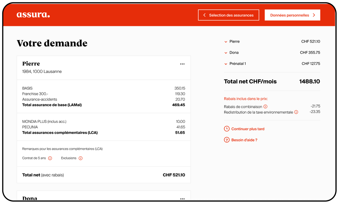
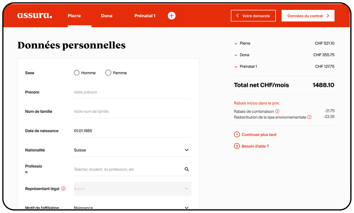
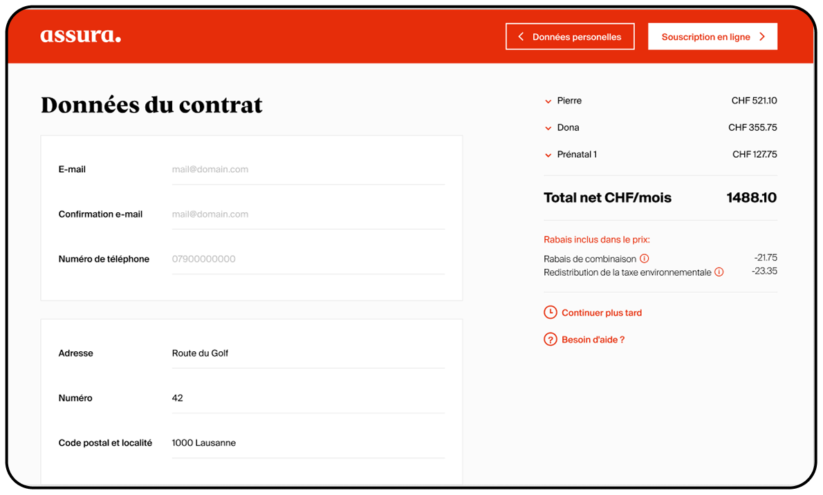
One of the most painful aspects of the existing tool was the considerable amount of information requested from the user. To solve this, the new flow only asks for the data that is strictly necessary at each step, splitting the journey into four simple pages: product selection, offer summary, personal data and contract data. The user always knows where they are and what comes next, and can go back and edit previous steps at any time without losing their progress.
Transparent
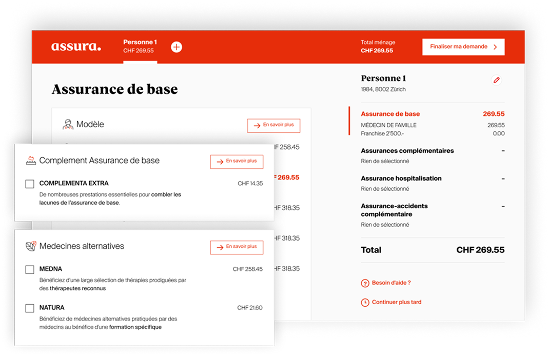
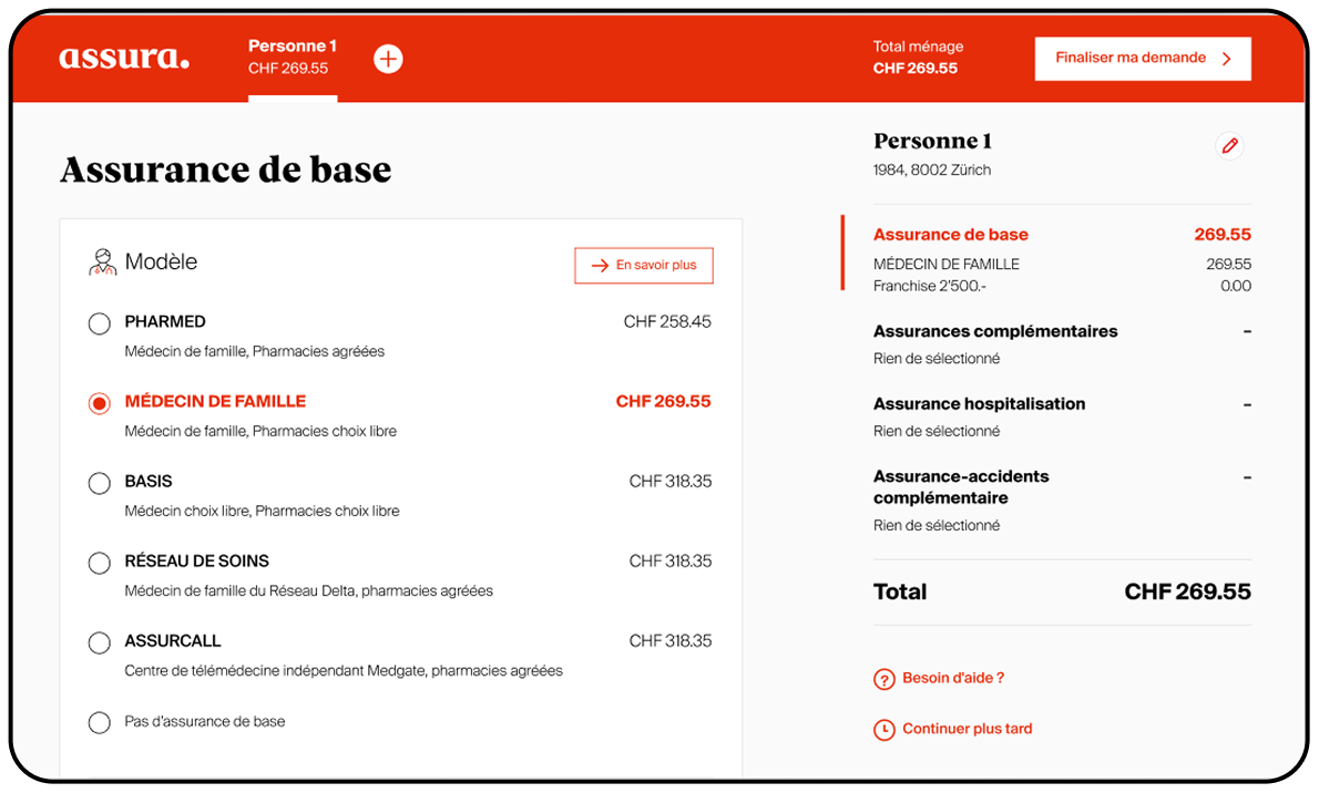
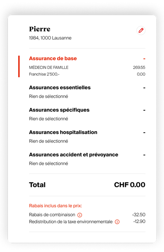
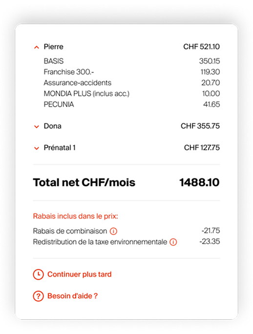
The prices are always visible and updated in real time: as the user selects or deselects an insurance product, the total premium is recalculated instantly and the breakdown is shown next to each item. There are no hidden costs — the summary panel follows the user along the journey so they always know the exact composition of their premium, including discounts and rebates.
Modular
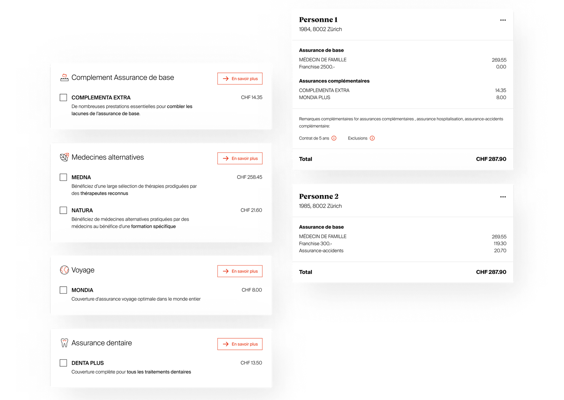
All the components of the calculator are designed to be modular: each insurance product, person or option is a self-contained block that can be added, removed or reordered. This allows the interface to scale from a single user to a whole family, and makes the product easy to extend with new offers in the future.
New branding
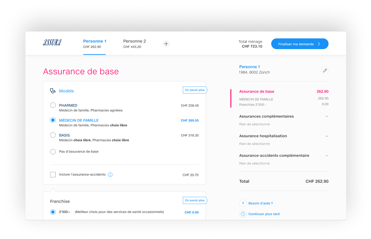
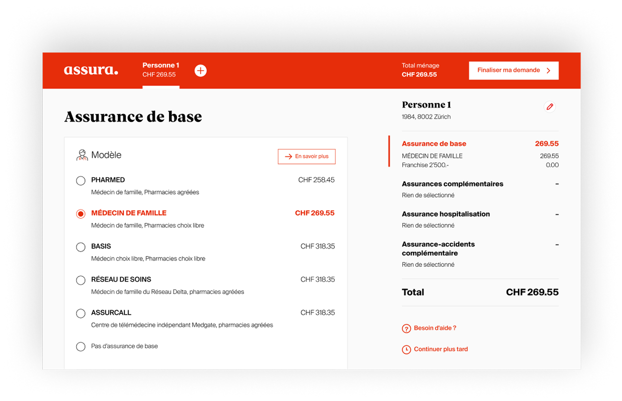
During the course of the project, Assura introduced a new brand identity. The calculator was one of the first digital touchpoints to adopt the new branding, which meant reworking colours, typography and components while the product was being designed.
Design system
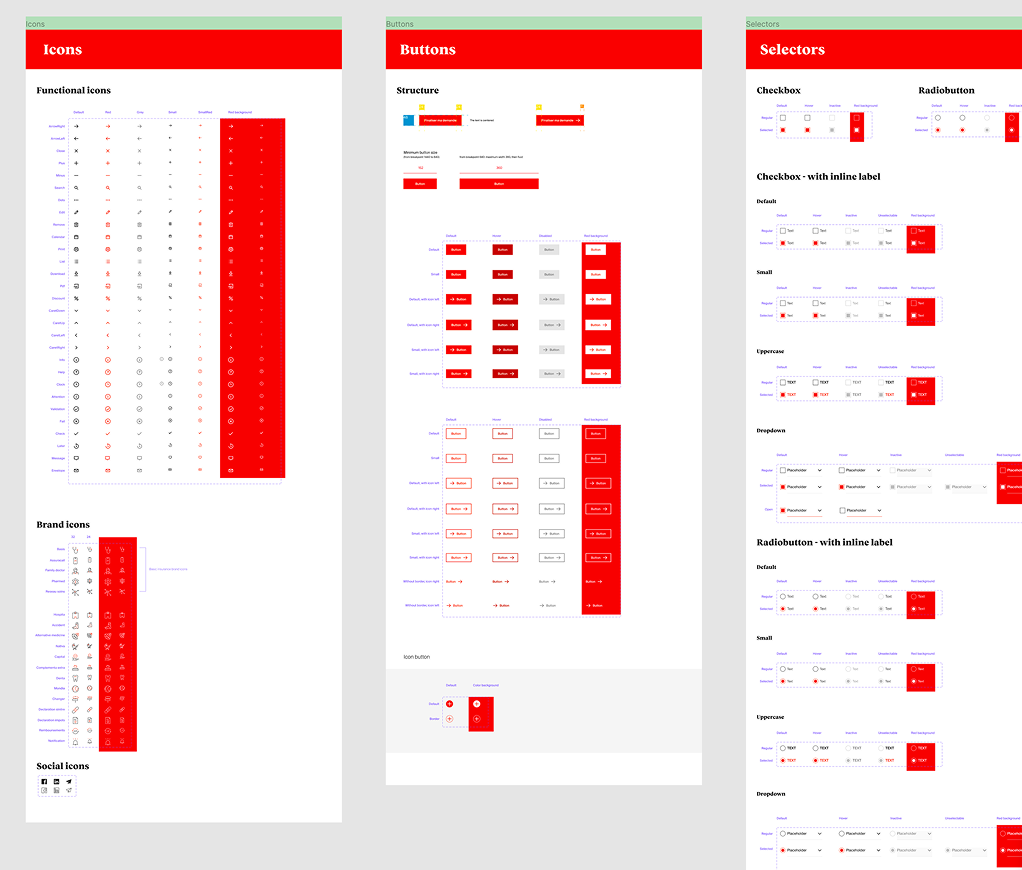
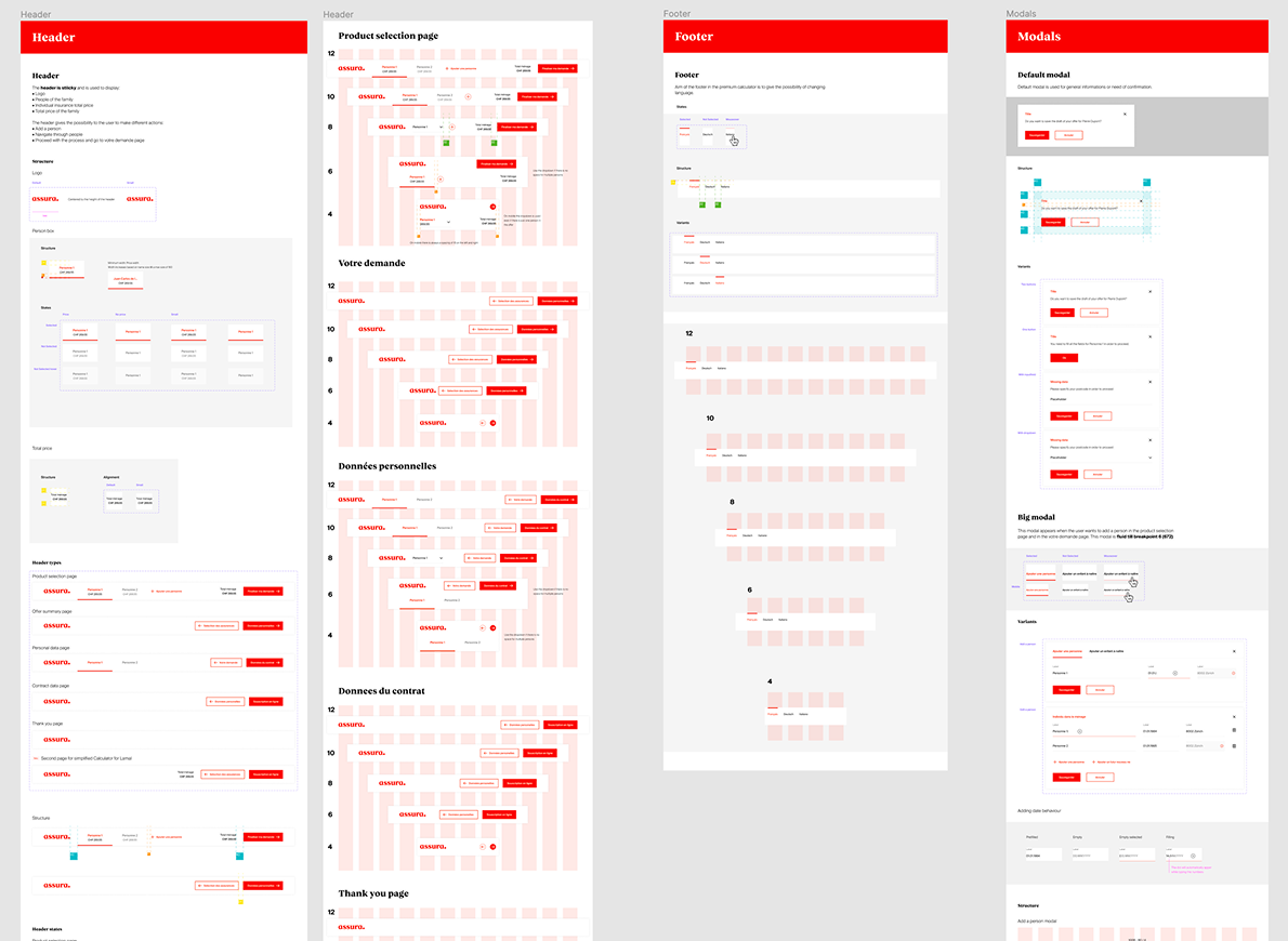
The adoption of the new design system was an integral part of the project. I designed and documented the components in Figma — buttons, inputs, accordions, summary panels and navigation elements — and worked side by side with the developers to ensure a faithful implementation and consistent behaviour across the whole product.